CERIC updates its brand identity
 CERIC has a refreshed brand identity to better reflect who we are and what we do. Recognizing that the scope of career development encompasses counselling and more, the charitable organization will use the name CERIC (to replace Canadian Education and Research Institute for Counselling) and add the descriptor “Advancing Career Development in Canada” to communicate its purpose and impact.
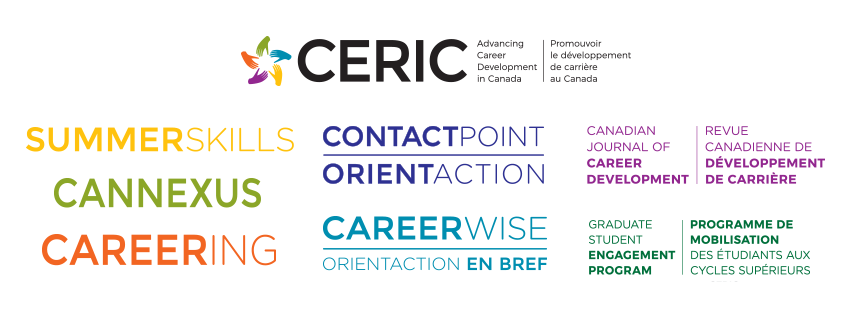
The evolution can be seen in an updated CERIC logo, which features a new, modern typography but also retains our familiar “hands/star” symbol, representing the strength and diversity of career development professionals, as well as CERIC’s commitment to providing the highest standard of education and research to advance the field.
As CERIC has grown over the past 13 years, so has the number of programs that it offers. The rebranding also involves streamlining the visual identity of its many sub-brands to more clearly connect them to CERIC and its partners. The programs and publications included in CERIC’s new brand architecture are its Cannexus National Career Development Conference, Canadian Journal of Career Development, ContactPoint / OrientAction online communities, Careering magazine, Summer Skills Academy and CareerWise / En Bref content curation.
The brand update comes after an extensive research and consultation process with CERIC’s multi-sectoral Board of Directors and Committees. With a view to the future, the direction is to build on the equity in and awareness of the CERIC brand, and at the same time, to also more fully communicate its value and aspirations.
CERIC is beginning the process of transitioning to its refreshed brand, and gradually implementing the new logos. Existing collateral materials will be used up responsibly over time.